Hello everyone! I hope you all had a fantastic Thanksgiving week with family and friends and enjoyed lots of food!
At last, here is my last post of the watercolor journey series!!! On this post I will be covering the Kuretake Gansai Tambi watercolor palette.
First I wanted to show you my Kuretake Gansai Tambi set. I got the set that comes with 36 colors from Amazon (there’s a smaller set available too!). These come with a lid where you can do your color chart for each of the paints which comes in handy specially since the names of the paints are in Japanese (it does have numbers to help with referencing too). Each paint container can be taken out of the palette for ease of use and the colors are BRIGHT and VIBRANT! It even has some metallic/shimmery paints! My favorite is the pearlescent white (#95 in the palette), its sooo shimmery and you can mix it with other paints to give it that shimmery look. Ok now onto my watercolor project. Here are the steps I took to create my watercolor piece:
- Stamped twice the large floral image from Simon Says Stamps “Floral Bliss” clear stamp set using Barely Beige ink from Simon Says Stamps onto Carson watercolor paper (doing no line coloring technique).
- Using a round 2 watercoloring brush (which I wetted with a cup of water that I had on the side), activated the paint and started applying color to the image using the wet on dry technique (meaning my watercolor paper was dried as I applied the wet paint).
- I applied the watercolor paint first in the areas of the image that I wanted to be the darkest for interest and not make the image seem flat. Also, I applied the paint in layers to build the color intensity and contrast. I did about 2-3 layers of color application on each section of the image. Lastly, I did some paint splatters in two colors (can you see the pearlescent white pain splatters!!! I just love that color!).
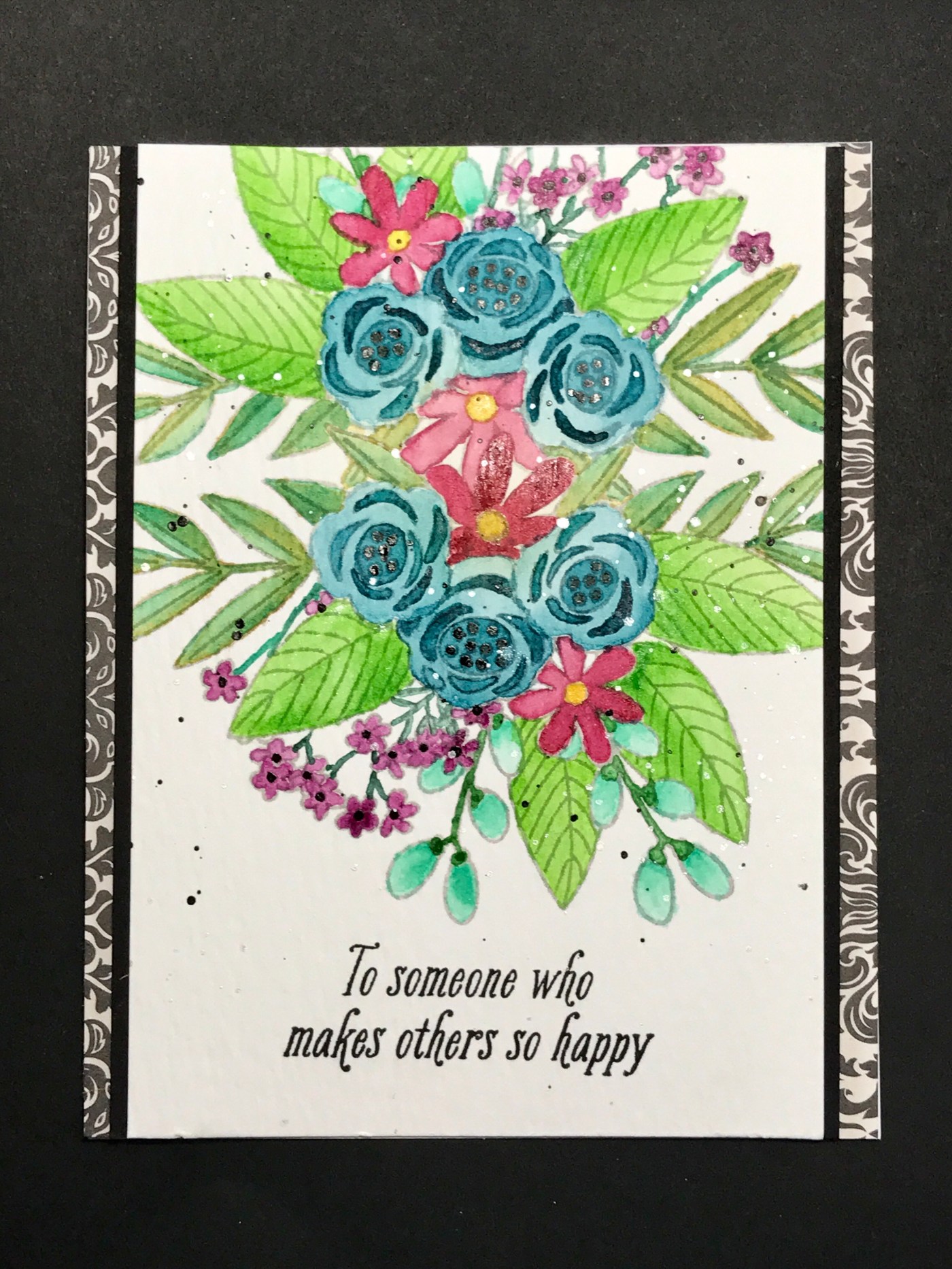
 To turn my watercolor piece into a card, I cut down the focal image to be 5.5″ x 3.25″. I used items that came in the Simons Says Stamps June 2017 Blissful kit: one of the pattern paper and the black color cardstock. In addition, I stamped the sentiment from the Avant-Garden Stampin Up set in VersaFine Black ink. See the final card below:
 Love how this card turned out! It looks so classy and vibrant at the same time.
Thanks so much for joining me on my watercolor journey. I definitely learned a lot about the different mediums and what I personally like or don’t like. Most of all, I learned that I can do this and not to give up… just keep trying!
Here’s a look at all the watercolor cards I made through this journey: I hope these post will inspire you to do some watercoloring of your own. Again just give it a try!
Thanks,
Yami

Leave a comment